Css3
Содержание:
CSS Reference
CSS ReferenceCSS Browser SupportCSS SelectorsCSS FunctionsCSS Reference AuralCSS Web Safe FontsCSS Fallback FontsCSS AnimatableCSS UnitsCSS PX-EM ConverterCSS ColorsCSS Color ValuesCSS Default ValuesCSS Entities
CSS Properties
align-content
align-items
align-self
all
animation
animation-delay
animation-direction
animation-duration
animation-fill-mode
animation-iteration-count
animation-name
animation-play-state
animation-timing-function
backface-visibility
background
background-attachment
background-blend-mode
background-clip
background-color
background-image
background-origin
background-position
background-repeat
background-size
border
border-bottom
border-bottom-color
border-bottom-left-radius
border-bottom-right-radius
border-bottom-style
border-bottom-width
border-collapse
border-color
border-image
border-image-outset
border-image-repeat
border-image-slice
border-image-source
border-image-width
border-left
border-left-color
border-left-style
border-left-width
border-radius
border-right
border-right-color
border-right-style
border-right-width
border-spacing
border-style
border-top
border-top-color
border-top-left-radius
border-top-right-radius
border-top-style
border-top-width
border-width
bottom
box-decoration-break
box-shadow
box-sizing
break-after
break-before
break-inside
caption-side
caret-color
@charset
clear
clip
clip-path
color
column-count
column-fill
column-gap
column-rule
column-rule-color
column-rule-style
column-rule-width
column-span
column-width
columns
content
counter-increment
counter-reset
cursor
direction
display
empty-cells
filter
flex
flex-basis
flex-direction
flex-flow
flex-grow
flex-shrink
flex-wrap
float
font
@font-face
font-family
font-feature-settings
font-kerning
font-size
font-size-adjust
font-stretch
font-style
font-variant
font-variant-caps
font-weight
gap
grid
grid-area
grid-auto-columns
grid-auto-flow
grid-auto-rows
grid-column
grid-column-end
grid-column-gap
grid-column-start
grid-gap
grid-row
grid-row-end
grid-row-gap
grid-row-start
grid-template
grid-template-areas
grid-template-columns
grid-template-rows
hanging-punctuation
height
hyphens
image-rendering
@import
isolation
justify-content
@keyframes
left
letter-spacing
line-height
list-style
list-style-image
list-style-position
list-style-type
margin
margin-bottom
margin-left
margin-right
margin-top
mask-image
mask-mode
mask-origin
mask-position
mask-repeat
mask-size
max-height
max-width
@media
min-height
min-width
mix-blend-mode
object-fit
object-position
opacity
order
orphans
outline
outline-color
outline-offset
outline-style
outline-width
overflow
overflow-wrap
overflow-x
overflow-y
padding
padding-bottom
padding-left
padding-right
padding-top
page-break-after
page-break-before
page-break-inside
perspective
perspective-origin
pointer-events
position
quotes
resize
right
row-gap
scroll-behavior
tab-size
table-layout
text-align
text-align-last
text-decoration
text-decoration-color
text-decoration-line
text-decoration-style
text-indent
text-justify
text-overflow
text-shadow
text-transform
top
transform
transform-origin
transform-style
transition
transition-delay
transition-duration
transition-property
transition-timing-function
unicode-bidi
user-select
vertical-align
visibility
white-space
widows
width
word-break
word-spacing
word-wrap
writing-mode
z-index
Property Values
| Value | Description |
|---|---|
| none | Default value. Animation will not apply any styles to the element before or after it is executing |
| forwards | The element will retain the style values that is set by the last keyframe (depends on animation-direction and animation-iteration-count) |
| backwards | The element will get the style values that is set by the first keyframe (depends on animation-direction), and retain this during the animation-delay period |
| both | The animation will follow the rules for both forwards and backwards, extending the animation properties in both directions |
| initial | Sets this property to its default value. Read about initial |
| inherit | Inherits this property from its parent element. Read about inherit |
Задержка анимации
CSS свойство animation-delay определяет задержку для запуска анимации. Задержка анимации задается в секундах (s), или миллисекундах (ms).
Значение 0s (значение по умолчанию) для свойства animation-delay, указывает, что анимация должна начаться без задержки. Если указать для анимации отрицательное значение задержки, то анимация начнет воспроизводиться без задержки, но со смещением равному указанному значению (т.е. если вы укажите -5s, то анимация будет воспроизведена без задержки и с того момента как будто она уже длится 5 секунд). Допускается указывать несколько значений, перечисленных через запятую (для каждой отдельной анимации).
<!DOCTYPE html>
<html>
<head>
	<meta charset = "UTF-8">
	<title>Задержка анимации</title>
<style>
div {
width: 75px; /* ширина элемента */
height: 75px; /* высота элемента */
border-radius: 100%; /* определяем форму углов элемента */
position: relative; /* элемент с относительным позиционированием */
animation-name: iliketomoveit; /* задаём имя анимации */
animation-duration: 5s; /* задаём продолжительность анимации */
animation-iteration-count: infinite; /* указываем, что анимация будет повторяться бесконечно  */
}
.test {
animation-delay: -500ms; /* устанавливаем отрицательную задержку равную -500ms (без задержки со смещением)  */
}
.test2 {
animation-delay: 1500ms; /* устанавливаем задержку анимации равную 1500 миллисекунд */
}
.test3 {
animation-delay: 2s; /* устанавливаем задержку анимации равную 2 секунды */
}
@keyframes iliketomoveit {
	0%   {left: 0px;} /* начало цикла анимации */
	25%  {left: 400px; background: red;} /* 25% от продолжительности анимации */
	75%  {left: 200px;} /* 75% от продолжительности анимации */
	100% {left: 0px; background: black;} /* конец цикла анимации */
}
</style>
</head>
	<body>
		<a href = "javascript:window.location.reload()">Обновите перед просмотром</a></br>
		<div class = "test">-500ms</div>
		<div class = "test2">1500ms</div>
		<div class = "test3">2s</div>
	</body>
</html>
В этом примере мы создали простую анимацию, в которой с помощью CSS свойства left смещаем элементы с относительным позиционированием относительно левого края текущей позиции, изменяя при этом цвет заднего фона элемента.
С использованием селектора класса и свойства animation-delay мы указали различные значения, которые определяют задержку для запуска анимации.
Результат нашего примера:
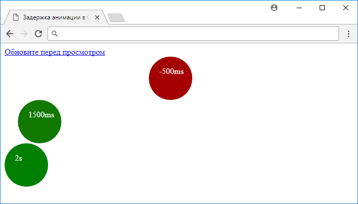
Рис. 194 Задержка анимации в CSS.
References
Normative references
- Bert Bos; et al. Cascading Style
Sheets Level 2 Revision 1 (CSS 2.1) Specification. 7 June
2011. W3C Recommendation. URL: http://www.w3.org/TR/2011/REC-CSS2-20110607/ - Dean Jackson; et al. CSS
Transitions. 3 April 2012. W3C Working Draft. (Work in
progress.) URL: http://www.w3.org/TR/2012/WD-css3-transitions-20120403/
Other references
- Håkon Wium Lie; Tab Atkins; Elika J. Etemad. CSS
Values and Units Module Level 3. 28 August 2012. W3C Candidate
Recommendation. (Work in progress.) URL: http://www.w3.org/TR/2012/CR-css3-values-20120828/ - Ben Caldwell; et al. Web Content
Accessibility Guidelines (WCAG) 2.0. 11 December 2008. W3C
Recommendation. URL: http://www.w3.org/TR/2008/REC-WCAG20-20081211/
CSS Properties
align-contentalign-itemsalign-selfallanimationanimation-delayanimation-directionanimation-durationanimation-fill-modeanimation-iteration-countanimation-nameanimation-play-stateanimation-timing-functionbackface-visibilitybackgroundbackground-attachmentbackground-blend-modebackground-clipbackground-colorbackground-imagebackground-originbackground-positionbackground-repeatbackground-sizeborderborder-bottomborder-bottom-colorborder-bottom-left-radiusborder-bottom-right-radiusborder-bottom-styleborder-bottom-widthborder-collapseborder-colorborder-imageborder-image-outsetborder-image-repeatborder-image-sliceborder-image-sourceborder-image-widthborder-leftborder-left-colorborder-left-styleborder-left-widthborder-radiusborder-rightborder-right-colorborder-right-styleborder-right-widthborder-spacingborder-styleborder-topborder-top-colorborder-top-left-radiusborder-top-right-radiusborder-top-styleborder-top-widthborder-widthbottombox-decoration-breakbox-shadowbox-sizingbreak-afterbreak-beforebreak-insidecaption-sidecaret-color@charsetclearclipclip-pathcolorcolumn-countcolumn-fillcolumn-gapcolumn-rulecolumn-rule-colorcolumn-rule-stylecolumn-rule-widthcolumn-spancolumn-widthcolumnscontentcounter-incrementcounter-resetcursordirectiondisplayempty-cellsfilterflexflex-basisflex-directionflex-flowflex-growflex-shrinkflex-wrapfloatfont@font-facefont-familyfont-feature-settingsfont-kerningfont-sizefont-size-adjustfont-stretchfont-stylefont-variantfont-variant-capsfont-weightgapgridgrid-areagrid-auto-columnsgrid-auto-flowgrid-auto-rowsgrid-columngrid-column-endgrid-column-gapgrid-column-startgrid-gapgrid-rowgrid-row-endgrid-row-gapgrid-row-startgrid-templategrid-template-areasgrid-template-columnsgrid-template-rowshanging-punctuationheighthyphensimage-rendering@importisolationjustify-content@keyframesleftletter-spacingline-heightlist-stylelist-style-imagelist-style-positionlist-style-typemarginmargin-bottommargin-leftmargin-rightmargin-topmask-imagemask-modemask-originmask-positionmask-repeatmask-sizemax-heightmax-width@mediamin-heightmin-widthmix-blend-modeobject-fitobject-positionopacityorderorphansoutlineoutline-coloroutline-offsetoutline-styleoutline-widthoverflowoverflow-wrapoverflow-xoverflow-ypaddingpadding-bottompadding-leftpadding-rightpadding-toppage-break-afterpage-break-beforepage-break-insideperspectiveperspective-originpointer-eventspositionquotesresizerightrow-gapscroll-behaviortab-sizetable-layouttext-aligntext-align-lasttext-decorationtext-decoration-colortext-decoration-linetext-decoration-styletext-indenttext-justifytext-overflowtext-shadowtext-transformtoptransformtransform-origintransform-styletransitiontransition-delaytransition-durationtransition-propertytransition-timing-functionunicode-bidiuser-selectvertical-alignvisibilitywhite-spacewidowswidthword-breakword-spacingword-wrapwriting-modez-index
Классы animate.css для изменения скорости анимации
По умолчанию анимация в animate.css воспроизводится в течение 1 секунды. За это отвечает обязательный для использования в animate.css класс .
Класс animate__animated, задающий скорость воспроизведения анимации в 1 секунду
.animate__animated {
-webkit-animation-duration: 1s;
animation-duration: 1s;
-webkit-animation-duration: var(—animate-duration);
animation-duration: var(—animate-duration);
-webkit-animation-fill-mode: both;
animation-fill-mode: both;
}
|
1 |
.animate__animated{ -webkit-animation-duration1s; animation-duration1s; -webkit-animation-durationvar(—animate-duration); animation-durationvar(—animate-duration); -webkit-animation-fill-modeboth; animation-fill-modeboth; } |
Для того чтобы увеличить или уменьшить скорость анимации, можно использовать такие классы:
Классы для замедления/ускорения анимации и скорость анимации для них
animate__slow 2s
animate__slower 3s
animate__fast 800ms
animate__faster 500ms
|
1 |
animate__slow2s animate__slower3s animate__fast800ms animate__faster500ms |
Попробуем использовать разные значения анимаций для нового примера.
See the Pen animate.css fast/normal/slow by Elen (@ambassador) on CodePen.0
Обратите внимание, что некоторые анимации имеют продолжительность менее 1 секунды. Вы можете изменить значение продолжительности анимации с помощью свойства , задав ее для , или локально для любого элемента
Изменение переменной —animate-duration
CSS
/* Увеличение продолжительности всех анимаций вдвое */
:root {
—animate-duration: 2s;
}
/* Уменьшение продолжительности анимации для элемента .my-element */
.my-element {
—animate-duration: 0.5s;
}
|
1 |
/* Увеличение продолжительности всех анимаций вдвое */ :root { —animate-duration2s; } .my-element { —animate-duration0.5s; } |
Basic Usage
- Include the stylesheet on your document’s
<head><linkrel="stylesheet"href="animate.min.css"></head>
<head><linkrel="stylesheet"href="https://cdn.jsdelivr.net/npm/animate.css@3.5.2/animate.min.css"><linkrel="stylesheet"href="https://cdnjs.cloudflare.com/ajax/libs/animate.css/3.5.2/animate.min.css"></head>
<head><linkrel="stylesheet"href="https://cdn.jsdelivr.net/npm/animate.css@3.5.2/animate.min.css"integrity="sha384-OHBBOqpYHNsIqQy8hL1U+8OXf9hH6QRxi0+EODezv82DfnZoV7qoHAZDwMwEJvSw"crossorigin="anonymous"><linkrel="stylesheet"href="https://cdnjs.cloudflare.com/ajax/libs/animate.css/3.5.2/animate.min.css"integrity="sha384-OHBBOqpYHNsIqQy8hL1U+8OXf9hH6QRxi0+EODezv82DfnZoV7qoHAZDwMwEJvSw"crossorigin="anonymous"></head>
-
Add the class to the element you want to animate. You may also want to include the class for an infinite loop.
-
Finally you need to add one of the following classes:
| Class Name | |||
|---|---|---|---|
Full example:
<h1class="animated infinite bounce delay-2s">Example</h1>
Animations
CSS Animations affect computed property values. During the execution of
an animation, the computed value for a property is controlled by the
animation. This overrides the value specified in the normal styling
system. Animations override all normal rules, but are overriden by
!important rules.
If at one point in time there are multiple animations specifying
behavior for the same property, the animation whose name occurs last in
the value of ‘’ will override the other
animations at that point.
An animation does not affect the computed value before the application
of the animation, before the animation delay has expired, and after the
end of the animation.
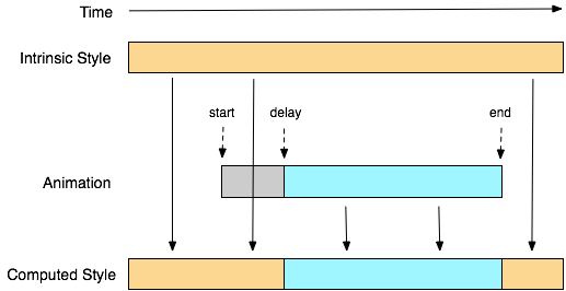
Computation of animated property values
The diagram above shows how property values are computed. The intrinsic
style is shown at the top of the diagram. The computed value is derived
from intrinsic style at the times when an animation is not running and
also when an animation is delayed (see below for specification of
animation delay). During an animation, the computed style is derived from
the animated value.
The start time of an animation is the latter of two moments: the time
at which the style is resolved that specifies the animation, or the time
the document’s load event is fired. Therefore, an animation specified in
the document style sheet will begin at the document load. An animation
specified on an element by modifying the style after the document has
loaded will start when the style is resolved. That may be immediately in
the case of a pseudo style rule such as hover, or may be when the
scripting engine returns control to the browser (in the case of style
applied by script).
An animation applies to an element if the element has a value for ‘’
that references a valid keyframes rule. Once an animation has started it
continues until it ends or the ‘’ is removed. The values used
for the keyframes and animation properties are snapshotted at the time the
animation starts. Changing them during the execution of the animation has
no effect. Note also that changing the value of ‘’
does not necessarily restart an animation (e.g., if a list of animations
are applied and one is removed from the list, only that animation will
stop; The other animations will continue). In order to restart an
animation, it must be removed then reapplied.
The end of the animation is defined by the combination of the ‘’, ‘’ and ‘’ properties.
div {
  animation-name: diagonal-slide;
  animation-duration: 5s;
  animation-iteration-count: 10;
}

@keyframes diagonal-slide {

  from {
    left: 0;
    top: 0;
  }

  to {
    left: 100px;
    top: 100px;
  }

}
This will produce an animation that moves an element from (0, 0) to
(100px, 100px) over five seconds and repeats itself nine times (for a
total of ten iterations).
Setting the display property to ‘’
will terminate any running animation applied to the element and its
descendants. If an element has a display of ‘’, updating display to a value other than
‘’ will start all animations applied
to the element by the ‘’ property, as well as all
animations applied to descendants with display other than ‘’.
While authors can use animations to create dynamically changing
content, dynamically changing content can lead to seizures in some users.
For information on how to avoid content that can lead to seizures, see ().
Summary
Regardless of your experience with CSS, following the instructions in this article will give you the ability to add stunning animations to any website.
However, animations are just one of the many CSS properties used by websites in order to display stunning content. Just about every element on your website will need some CSS in order to look right: text, backgrounds, images, videos…
If you don’t want to spend days learning or fiddling with code, we’d recommend trying a website builder like PageCloud that offers a user-friendly interface enabling you to customize the look of your site without writing a single line of code.
Best of all, PageCloud offers a world-class support team that will be happy to answer any of your questions, even during your free trial!
Property Values
| Value | Description |
|---|---|
| animation-name | Specifies the name of the keyframe you want to bind to the selector |
| animation-duration | Specifies how many seconds or milliseconds an animation takes to complete |
animation-timing-function |
Specifies the speed curve of the animation |
| animation-delay | Specifies a delay before the animation will start |
animation-iteration-count |
Specifies how many times an animation should be played |
| animation-direction | Specifies whether or not the animation should play in reverse on alternate cycles |
| animation-fill-mode | Specifies what values are applied by the animation outside the time it is executing |
| animation-play-state | Specifies whether the animation is running or paused |
| initial | Sets this property to its default value. Read about initial |
| inherit | Inherits this property from its parent element. Read about inherit |
CSS Properties
align-contentalign-itemsalign-selfallanimationanimation-delayanimation-directionanimation-durationanimation-fill-modeanimation-iteration-countanimation-nameanimation-play-stateanimation-timing-functionbackface-visibilitybackgroundbackground-attachmentbackground-blend-modebackground-clipbackground-colorbackground-imagebackground-originbackground-positionbackground-repeatbackground-sizeborderborder-bottomborder-bottom-colorborder-bottom-left-radiusborder-bottom-right-radiusborder-bottom-styleborder-bottom-widthborder-collapseborder-colorborder-imageborder-image-outsetborder-image-repeatborder-image-sliceborder-image-sourceborder-image-widthborder-leftborder-left-colorborder-left-styleborder-left-widthborder-radiusborder-rightborder-right-colorborder-right-styleborder-right-widthborder-spacingborder-styleborder-topborder-top-colorborder-top-left-radiusborder-top-right-radiusborder-top-styleborder-top-widthborder-widthbottombox-decoration-breakbox-shadowbox-sizingbreak-afterbreak-beforebreak-insidecaption-sidecaret-color@charsetclearclipclip-pathcolorcolumn-countcolumn-fillcolumn-gapcolumn-rulecolumn-rule-colorcolumn-rule-stylecolumn-rule-widthcolumn-spancolumn-widthcolumnscontentcounter-incrementcounter-resetcursordirectiondisplayempty-cellsfilterflexflex-basisflex-directionflex-flowflex-growflex-shrinkflex-wrapfloatfont@font-facefont-familyfont-feature-settingsfont-kerningfont-sizefont-size-adjustfont-stretchfont-stylefont-variantfont-variant-capsfont-weightgapgridgrid-areagrid-auto-columnsgrid-auto-flowgrid-auto-rowsgrid-columngrid-column-endgrid-column-gapgrid-column-startgrid-gapgrid-rowgrid-row-endgrid-row-gapgrid-row-startgrid-templategrid-template-areasgrid-template-columnsgrid-template-rowshanging-punctuationheighthyphensimage-rendering@importisolationjustify-content@keyframesleftletter-spacingline-heightlist-stylelist-style-imagelist-style-positionlist-style-typemarginmargin-bottommargin-leftmargin-rightmargin-topmask-imagemask-modemask-originmask-positionmask-repeatmask-sizemax-heightmax-width@mediamin-heightmin-widthmix-blend-modeobject-fitobject-positionopacityorderorphansoutlineoutline-coloroutline-offsetoutline-styleoutline-widthoverflowoverflow-wrapoverflow-xoverflow-ypaddingpadding-bottompadding-leftpadding-rightpadding-toppage-break-afterpage-break-beforepage-break-insideperspectiveperspective-originpointer-eventspositionquotesresizerightrow-gapscroll-behaviortab-sizetable-layouttext-aligntext-align-lasttext-decorationtext-decoration-colortext-decoration-linetext-decoration-styletext-indenttext-justifytext-overflowtext-shadowtext-transformtoptransformtransform-origintransform-styletransitiontransition-delaytransition-durationtransition-propertytransition-timing-functionunicode-bidiuser-selectvertical-alignvisibilitywhite-spacewidowswidthword-breakword-spacingword-wrapwriting-modez-index
Свойства CSS3-анимации
Давайте познакомимся с основным перечнем свойств CSS3-анимации:
- задержка;
- запуск и остановка;
- повторное воспроизведение;
- состояние до начала анимации и после ее окончания;
- направление движения.
Помимо основных свойств анимации можно задействовать дополнительные, которые нужны для построения усложненных эффектов.
Задержка анимации: свойство animation-delay
Задержка анимации или обозначает, сколько времени пройдет до начала воспроизведения. Свойство прописывается в секундах или миллисекундах:
element {
  animation-name: animation-1;
  animation-duration: 2s;
  animation-delay: 3s; // перед запуском анимации пройдет 3 секунды
}
Повторное воспроизведение анимации: свойство animation-iteration-count
Повторное воспроизведение анимации записывается как . Его можно указывать в виде количества повторов анимации, например, 0 или 3 раза.
Также можно зациклить анимацию, сделав ее постоянно воспроизводящейся, для этого в свойстве прописывается .
Фрагмент кода с использованием задержки и повторного воспроизведения будет выглядеть следующим образом:
element {
  animation-name: example;
  animation-duration: 3s;
  animation-delay: 2s;
  animation-iteration-count: infinite; // анимация будет зацикленной
}
Состояние элемента до и после: свойство animation-fill-mode
Следующий параметр CSS3-анимации — состояние элемента до и после. Оно называется . Для него после двоеточия можно прописать следующие значения:
- — означает, что после завершения анимации элемент окажется в состоянии последнего кейфрейма;
- — стандартное значение, при котором состояние элемента не изменяется;
- — определяет, что перед началом анимации элемент будет в состоянии первого кейфрейма, а после завершения перейдет в последний;
- — когда анимация завершится, элемент вернется в состояние первого кейфрейма.
Для одной и той же анимации можно использовать разные состояния до и после, получая новые варианты движения.
Синтаксис будет выглядеть следующим образом:
animation-fill-mode: none;
animation-fill-mode: forwards;
animation-fill-mode: backwards;
animation-fill-mode: both;
animation-fill-mode: none, backwards;
animation-fill-mode: both, forwards, none;
Запуск и остановка анимации: animation-play-state
Свойство запуска и остановки анимации прописывается как . Оно принимает лишь два основных варианта значений: или . А также — устанавливает значение свойства в значение по умолчанию, и — наследует значение от родительского элемента.
Синтаксис:
animation-play-state: running;
animation-play-state: paused;
animation-play-state: paused, running, running;
animation-play-state: initial;
animation-play-state: inherit;
Направление анимации: свойство animation-direction
Направление анимации или определяет направление воспроизведения. Для него существует несколько возможных значений, среди которых:
- — последовательный порядок;
- — четные повторы в нормальном порядке, а нечетные — в обратном;
- — обратный порядок;
- — нечетные повторы в прямом, а четные — в обратном порядке;
- — устанавливает значение свойства в значение по умолчанию;
- — наследует значение от родительского элемента.
Использование разных значений для одних и тех же кадров позволит получить несколько вариантов анимации, которые будут различаться между собой.
Синтаксис:
animation-direction: normal;
animation-direction: reverse;
animation-direction: alternate;
animation-direction: alternate-reverse;
animation-direction: normal, reverse;
animation-direction: alternate, reverse, normal;
animation-direction: initial;
animation-direction: inherit;


